Border
border sets the style and thickness of an element's border.
Basic Concepts
Border Sides
You can set border(s) on the four sides of an element: top, right, bottom, left.
You can also specify border side(s) based on the direction of writing (these would be based on writing-mode, direction, and text-orientation values):
- Inline direction — is the direction of writing (e.g. left-to-right, right-to-left, top-to-bottom)
- Block direction — is the direction perpendicular to inline position (i.e. the direction of how you add new lines to your paragraph)
Border Styles
There are different kinds of border styles:
border-style="..." | Preview |
|---|---|
none | |
hidden | |
solid | |
dashed | |
dotted | |
double | |
groove | |
ridge | |
inset | |
outset |
Border Radius
Each corner of the element can have 2 radii.
If you specify more than one radius for a corner, the first one would be the horizontal radius, and the second one would be the vertical radii.
<div id="border-radius-example"></div>#border-radius-example {
height: 50px;
background-color: #99d;
/* Circular corner */
border-top-left-radius: 40px;
/* Horizontal radius, vertical radius */
border-top-right-radius: 20px 40px;
}Common Border Properties
border
Shorthand for border-width, border-style, border-color.
You can specify each one optionally. The order does not matter.
<div id="border-example">
  Hello!
</div>#border-example {
border: 4px solid green;
}border-width
Shorthand of border-top-width, border-right-width, border-bottom-width, border-left-width (remember: clockwise direction).
If you specify less than 4 values, it will attempt to make symmetrical border width.
border-style
Shorthand of border-top-style, border-right-style, border-bottom-style, border-left-style (remember: clockwise direction).
If you specify less than 4 values, it will attempt to make symmetrical border style.
border-color
Shorthand of border-top-color, border-right-color, border-bottom-color, border-left-color (remember: clockwise direction).
If you specify less than 4 values, it will attempt to make symmetrical border color.
border-<side>-<property>
E.g. border-top-color, where:
<side>is one of:top,right,bottom,left,block,block-start,block-end,inline,inline-start,inline-end<property>width,style,color
Sets the border width, style, or color on the respective side.
border-radius
Shorthand of border-top-left-radius, border-top-right-radius, border-bottom-right-radius, border-bottom-left-radius (remember: clockwise direction from top-left).
If you specify less than 4 values, it will attempt to make symmetrical border radii.
Using /, you can specify secondary radius for each corners.
div {
  /* Specifying radius for all 4 corners */
  border-radius: 10px 20px 10px 20px;
  /* Specifying secondary radius */
  /* <horizontal-radii> / <vertical-radii> */
  border-radius: 10px 20px 10px 20px / 20px;
  border-radius: 10px 20px 10px 20px / 20px 10px 20px 10px;
}
border-<corner>-radius
E.g. border-top-left-color, where:
<corner>is one of:top-left,top-right,bottom-right,bottom-left,start-start,start-end,end-start,end-end(for start/end: block direction is mentioned first, then inline direction),
Sets the border radius on the respective corner.
Border Image Properties
border-image
Shorthand for border-image-source, border-image-slice, border-image-width, border-image-outset, border-image-repeat.
Possible syntaxes for value:
<source><source> <slice><source> <slice> / <width><source> <slice> / <width> / <outset><source> <slice> / <width> / <outset> <repeat>
<div id="border-image-example">
  Sample content<br>
  One, two, three!
</div>#border-image-example {
background-color: #ddf;
/* Need to set border-style, otherwise it's not displayed on Chrome */
border-style: solid;
/* The 5px outset makes the border pokes a little bit outside */
border-image: url("/res/web/css/border-diamonds.png") 30 / 18px / 5px round;
}One, two, three!
border-image-source
Sets the image for the border.
border-image-slice
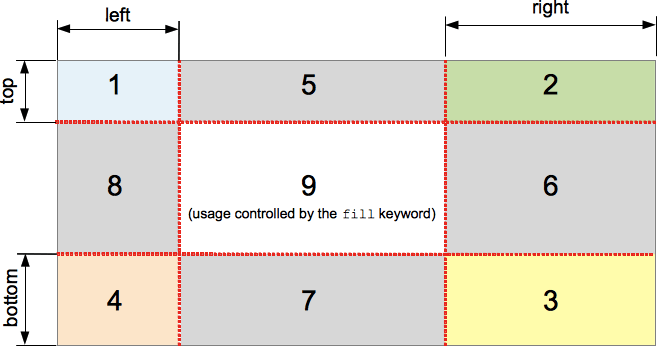
Defines how the image should be sliced into 9 regions. (Note that you don't put px unit for the values here.)
Takes a maximum of 4 values (top, right, bottom, left). If you specify less than four, it will attempt to slice the image symmetrically.
If you add the fill keyword (e.g. border-image-slice: 10 10 fill), the middle region will be displayed like a background image, but stacked above the actual background.

border-image-slice slices an image into 9 regions. (Source: MDN)border-image-width
Specifies how wide the border image is.
Takes a maximum of 4 values (top, right, bottom, and left border width). If you specify less than four, it will attempt to set the border width symmetrically.
If you specify auto, then that side's border width will be set to the matching the region's width/height (see border-image-slice).
border-image-outset
Sets how far the border the border image area "extends past the border box".
Takes a maximum of 4 values (top, right, bottom, and left outset). If you specify less than four, it will attempt to set the missing values symmetrically.
border-area-repeat
Sets how the sliced edge regions should be repeated to fill the border area. (The four corner regions are never repeated.)
Takes a maximum of 4 values for each of the sides (top, right, bottom, and left). If you specify less than four, it will attempt to set the missing values symmetrically.
Possible values:
stretch— stretch to fill the area (default)repeat— tile to fill the area, let the tile clip if there are not enough spacesround— tile to fill the area, stretch the tiles to fit the remaing spacespace— tile to fill the area, distribute the remaining space as gaps between the tiles
Assets
- Border image example (MDN) — Appeared in https://developer.mozilla.org/en-US/docs/Web/CSS/border-image — https://interactive-examples.mdn.mozilla.net/media/examples/border-diamonds.png
- Border image slice example (MDN) — Appeared in https://developer.mozilla.org/en-US/docs/Web/CSS/border-image-slice — https://developer.mozilla.org/en-US/docs/Web/CSS/border-image-slice/border-image-slice.png
References
- border (MDN) — https://developer.mozilla.org/en-US/docs/Web/CSS/border
- border-style (MDN) — https://developer.mozilla.org/en-US/docs/Web/CSS/border-style
- border-radius (MDN) — https://developer.mozilla.org/en-US/docs/Web/CSS/border-radius
- border-image (MDN) — https://developer.mozilla.org/en-US/docs/Web/CSS/border-image
- border-image (CSS-Tricks) — https://css-tricks.com/almanac/properties/b/border-image/
- border-image-slice (MDN) — https://developer.mozilla.org/en-US/docs/Web/CSS/border-image-slice