Display: Grid
Using display: grid allows you to lay out elements in a two-dimensional grid system.
<nav id="grid-example">
  <div class="box1">One</div>
  <div class="box2">Two</div>
  <div class="box3">Three</div>
  <div class="box4">Four</div>
  <div class="box5">Five</div>
</nav>/* Grid container */
#grid-example {
display: grid;
grid-template-columns: repeat(3, 1fr);
grid-auto-rows: 50px;
}
/* Grid children */
#grid-example div {
padding: 10px;
border: 1px solid #aaa;
background-color: #ddd;
}
.box1 {
grid-column-start: 1;
grid-column-end: 4;
grid-row-start: 1;
grid-row-end: 3;
}
.box2 {
grid-column-start: 1;
grid-row-start: 3;
grid-row-end: 5;
}Terminologies
Grid container and grid item:
- Grid containers refer to the element which you set
display: gridordisplay: inline-grid. - Grid items refer to the direct children of a grid container.
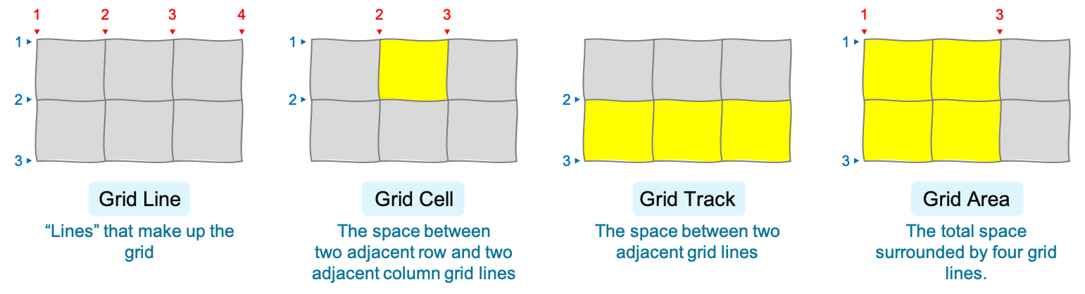
Grid structure:
- Grid lines are "lines" that make up the structure of the grid. There are row and column grid lines (numbered 1, 2, 3, ...).
- Grid cell is the space between two adjacent row and two adjacent column grid lines.
- Grid track is the space between two adjacent grid lines.
- Grid area is the total space surrounded by four grid lines (two row and two column grid lines).
The fr Unit
fr is the ratio of the remaining space to be given to the grid items (after those with fixed sizes have been "placed").
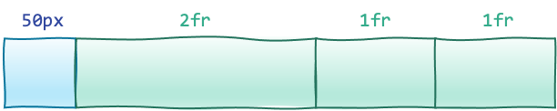
fr unit. 2fr will be twice as large as 1fr.Grid Container Properties
Tip!
If you easily mix up justify-content, align-content, justify-items, and align-items properties, just remember from "Display: Flex" page:
"Justify along the main axis, align along the cross axis"
However, in this case:
- the "main axis" is the inline-axis (the direction where sentence flows; normally horizontal except when writing vertically),
- the "cross axis" is the block-axis (the direction perpendicular to the inline axis).
grid-template-rows
Like grid-template-columns, but for the rows.
grid-template-columns
Defines column grid track sizes (and optionally, the grid line names).
Instead of specifying a length, you can also specify:
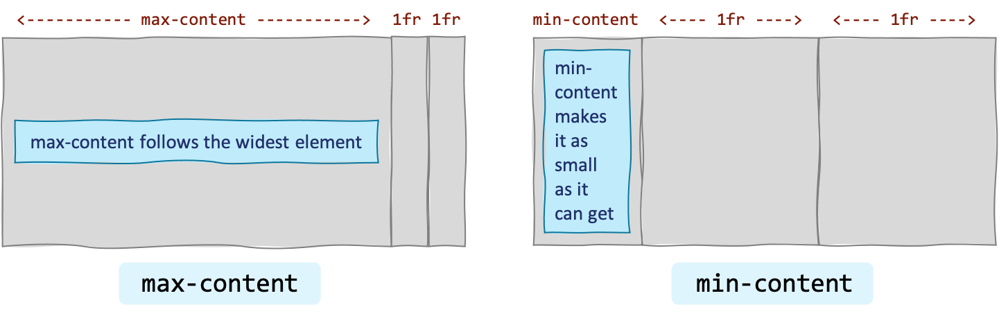
none— Make no explicit grid. All columns will be implicitly generated and their size will be determined by thegrid-auto-columnspropertymax-content— Make the grid track "as wide as the widest element it contains."min-content— Make the grid track "as wide as the narrowest element it contains," without causing an overflow.auto— Automatically set the track size between (1) the largest minimum size (set bymin-widthormin-height), and (2)max-content.
.container {
  /* Make three columns */
  grid-template-columns: 100px 100px 1fr;

  /* How to add grid line names */
  /* Add multiple names like this: `[name1 name2]` */
  grid-template-columns: [one] 100px [two] 100px [three] 1fr [four];
}
grid-template-areas
Lays out named grid-area into the grid. You will need to specify grid-area: name on the grid items.
(Alternatively, you can use grid-row-* and grid-column-* on the grid items to specify their locations in the grid.)
Each string represent separate rows. Spaces separate columns. A . (dot) represents an empty cell.
<nav id="grid-template-areas-example">
  <div class="a">A</div>
  <div class="b">B</div>
  <div class="c">C</div>
</nav>/* Grid container */
/* Note that grid area "a" takes the top-left 2x2 cells */
#grid-template-areas-example {
display: grid;
grid-template-columns: 1fr 1fr 1fr;
grid-template-rows: 30px 30px 30px;
grid-template-areas:
"a a ."
"a a ."
". b c";
}
/* Grid items */
#grid-template-areas-example .a {
grid-area: a;
background-color: #fdd;
}
#grid-template-areas-example .b {
grid-area: b;
background-color: #dfd;
}
#grid-template-areas-example .c {
grid-area: c;
background-color: #ddf;
}grid-template
Shorthand for setting grid-template-rows, grid-template-columns, and grid-template-areas in a single declaration.
none— Sets all three longhand properties tonone(no explicit grid). Rows and columns will be implicitly generated; their size will be determined by thegrid-auto-rowsandgrid-auto-columnsproperties.<grid-template-rows> / <grid-template-columns>— E.g.10px 10px / 20px 20px. Setsgrid-template-rowsandgrid-template-columnsto the specified values, andgrid-template-areastonone(no named grid areas)<grid-template-areas> <grid-template-rows> / <grid-template-column>— See the example below.
.container {
  /* Those beside the strings are row track sizes */
  /* Those after '/' are column track sizes */
  grid-template:
    [head-top] 'a a a' auto [head-bottom]
    [main-top] 'b b b' 1fr [main-bottom]
    / auto 1fr auto;
}
grid-auto-rows
Like grid-template-rows, but for columns that are created implicitly.
(Rows are created implicitly by placing a grid item out of range, or when grid auto-placement algorithm created one.)
grid-auto-columns
Like grid-template-columns, but for columns that are created implicitly.
(Columns are created implicitly by placing a grid item out of range, or when grid auto-placement algorithm created one.)
grid-auto-flow
Controls how grid auto-placement algorithm works.
row— fill in each row in turn, adding new rows as necessary (default)column— fill in each column in turn, adding new columns as necessarydense— attempt to fill in earlier holes in the grid, if smaller items come up later (may cause items to appear out-of-order)row densecolumn dense
grid
Shorthand for setting all of the explicit and implicit grid properties in a single declaration (grid-template-rows, grid-template-columns, grid-template-areas, grid-auto-rows, grid-auto-columns, and grid-auto-flow).
Note: When specifying auto-flow on either row or column side, the "length" on that side refers to the implicit track size. "You can only specify the explicit or the implicit grid properties in a single grid declaration."
.container {
  /* <explicit-rows> / <explicit-columns> */
  grid: 100px 100px / 200px 200px;

  /* <implicit-rows> / <explicit-columns> */
  /* Set auto-flow to row, and make it dense
  /* (the 100px here is the `grid-auto-rows` size) */
  grid: auto-flow dense 100px / 200px 200px;

  /* <explicit-rows> / <implicit-columns> */
  /* Set auto-flow to row, and make it dense
  /* (the 200px here is the `grid-auto-columns` size) */
  grid: 100px 100px / auto-flow dense 200px ';
}
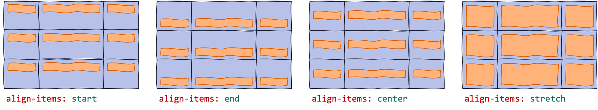
align-items
Defines how items are aligned along the block-axis (perpendicular to writing direction).
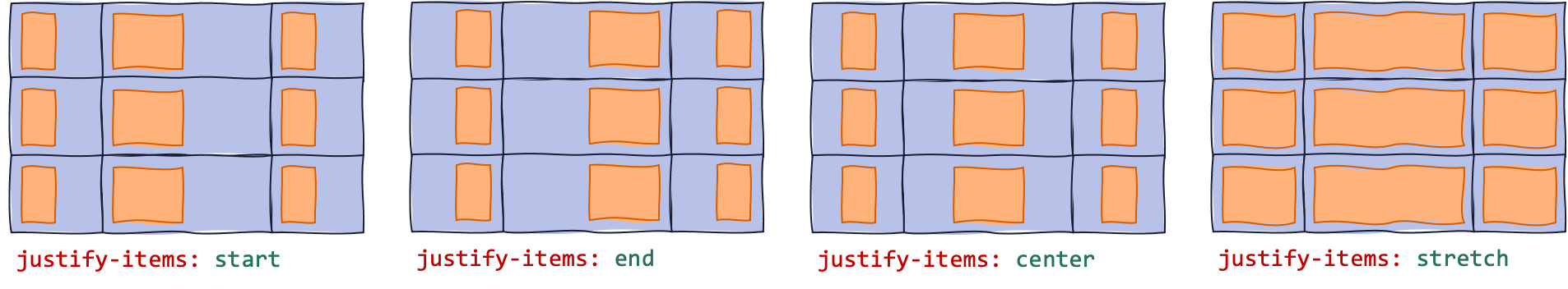
justify-items
Defines how items are aligned along the inline-axis (the writing direction).
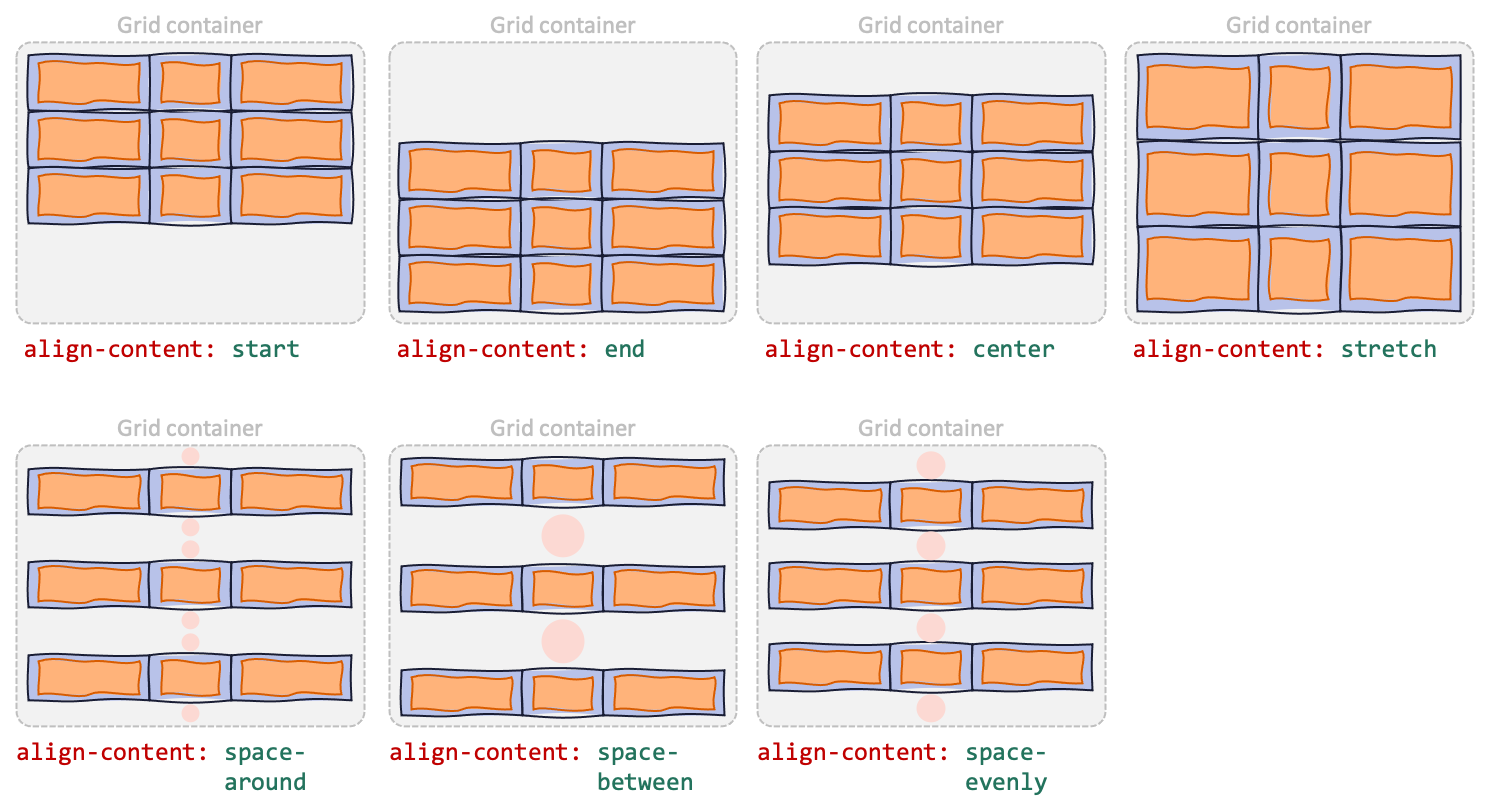
align-content
Defines how the "content" (grid) is aligned along the block-axis, if there's an extra space in the grid container.
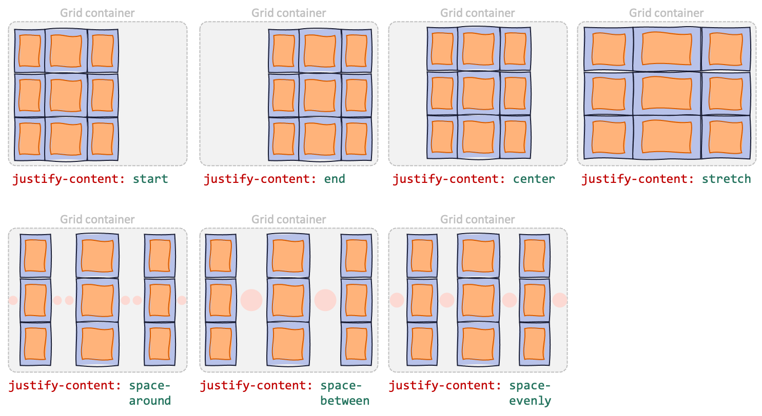
justify-content
Defines how the "content" (grid) is aligned along the inline-axis, if there's an extra space in the grid container.
place-items
Shorthand for align-items and justify-items.
.container {
  place-items: <align-items> / <justify-items>;
}
place-content
Shorthand for align-content and justify-content.
.container {
  place-items: <align-content> / <justify-content>;
}
row-gap
Specifies gutter size between rows.
column-gap
Specifies gutter size between columns.
gap
Shorthand for row-gap and column-gap
.container {
  gap: <row-and-column-gap>;
  gap: <row-gap> <column-gap>;
}
Grid Item Properties
grid-row-start
Specifies a grid item's position in the grid.
auto— Place the item automatically (default).<lineName>— Place the item from the row line whose name islineName-startorlineName.<number>or<lineName> <number>— E.g.3ormy-line 3. Place the item from thenumber-th row line (counting backwards if it is negative). IflineNameis specified, then only lines with that name is counted.span <number>orspan <lineName> <number>— E.g.span 3orspan my-line 3. Place the item's row start linenumberlines away from the row end line. (Seegrid-row-endvalue or place the item automatically first to determine the row end line.) IflineNameis specified, then only lines with that name is counted.
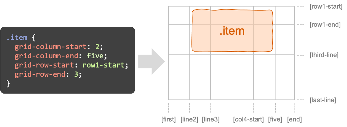
grid-row-* and grid-column-* (adapted from CSS-Tricks).grid-row-end
Specifies a grid item's position in the grid.
auto— Place the item automatically (default).<lineName>— Place the item until the row line whose name islineName-endorlineName.<number>or<lineName> <number>— E.g.3ormy-line 3. Place the item until thenumber-th row line (counting backwards if it is negative). IflineNameis specified, then only lines with that name is counted.span <number>orspan <lineName> <number>— E.g.span 3orspan my-line 3. Place the item's row end linenumberlines away from the row start line. (Seegrid-row-startvalue or place the item automatically first to determine the row start line.) IflineNameis specified, then only lines with that name is counted.
grid-column-start
Specifies a grid item's position in the grid.
(See grid-row-start explanation for the list of possible values.)
grid-column-end
Specifies a grid item's position in the grid.
(See grid-row-end explanation for the list of possible values.)
grid-row
Shorthand for grid-row-start and grid-row-end.
.item {
  grid-row: <grid-row-start>;
  grid-row: <grid-row-start> / <grid-row-end>;
}
grid-column
Shorthand for grid-column-start and grid-column-end.
.item {
  grid-column: <grid-column-start>;
  grid-column: <grid-column-start> / <grid-column-end>;
}
grid-area
Gives an item a name so it can be referenced in grid-template-areas.
Alternatively, this is a shorthand for grid-row-start, grid-column-start, grid-row-end, and grid-column-end.
.item {
  /* Main patterns */
  grid-area: <name>;
  grid-area: <grid-row-start> / <grid-column-start> / <grid-row-end> / <grid-column-end>;
  /* Yea, you can do these too */
  /* See how browsers interpret the meaning value here: */
  /* https://developer.mozilla.org/en-US/docs/Web/CSS/grid-area */
  grid-area: <grid-row-start> / <grid-column-start> / <grid-row-end>;
  grid-area: <grid-row-start> / <grid-column-start>;
  grid-area: <grid-row-start>;
}
align-self
Override align-items value for this item only. Specify: auto, start, end, center, or stretch.
(auto means use the container's align-items value.)
justify-self
Override justify-items value for this item only. Specify: auto, start, end, center, or stretch.
(auto means use the container's justify-items value.)
place-self
Shorthand for align-self and justify-self
(If you omit <justify-self>, then the value of <align-self> is used to set both properties.)
.item {
  place-self: auto;
  place-self: <align-self> / <justify-self>;
  place-self: <align-self>;
}
CSS Functions
minmax(min, max)
Defines the allowed size range for a grid track. For example, you want a column to be between 200px and 500px (inclusive), depending on the grid container's width.
Instead of specifying a length for min or max, you can also specify:
max-content— Make the grid track "as wide as the widest element it contains."min-content— Make the grid track "as wide as the narrowest element it contains," without causing an overflow.auto— When specified as max, it is identical tomax-content. When specified as min, it follows the largest minimum size (set bymin-widthormin-height).
repeat(count, trackSizes)
Repeat the sizes specified in trackSizes. You can specify more than one lengths for trackSizes.
Instead of specifying a number for count, you can also specify these special values:
auto-fill— Set count to the highest number that does not cause the grid to overflowauto-fit— Behaves likeauto-fill, but all empty tracks are collapsed (so the filled tracks can grow to fill the remaining space)
Instead of specifying a length for trackSizes, you can also specify these special values:
max-content— Make the grid track "as wide as the widest element it contains."min-content— Make the grid track "as wide as the narrowest element it contains," without causing an overflow.auto— Automatically set the track size between (1) the largest minimum size (set bymin-widthormin-height), and (2)max-content.
.container {
  /* Same meaning */
  grid-template-columns: repeat(3, 1fr);
  grid-template-columns: 1fr 1fr 1fr;
  /* Also, same meaning */
  grid-template-columns: repeat(3, 1rem 20px);
  grid-template-columns: 1rem 20px 1rem 20px 1rem 20px;
}
fit-content(length)
Specifies track size of length, but ensuring that the final value is between auto (min) and max-content (max).
(With auto as the minimum value, it means the minimum value won't be smaller than min-height or min-width that you specified on the track.)
References
- A Complete Guide to Grid (CSS Tricks) — https://css-tricks.com/snippets/css/complete-guide-grid/
- Basic Concepts of grid layout (MDN) — https://developer.mozilla.org/en-US/docs/Web/CSS/CSS_Grid_Layout/Basic_Concepts_of_Grid_Layout
- Box alignment in grid layout (MDN) — https://developer.mozilla.org/en-US/docs/Web/CSS/CSS_Box_Alignment/Box_Alignment_In_Grid_Layout
- grid-template-areas (MDN) — https://developer.mozilla.org/en-US/docs/Web/CSS/grid-template-areas
- grid-template (MDN) — https://developer.mozilla.org/en-US/docs/Web/CSS/grid-template
- grid-auto-columns (MDN) — https://developer.mozilla.org/en-US/docs/Web/CSS/grid-auto-columns
- grid (MDN) — https://developer.mozilla.org/en-US/docs/Web/CSS/grid
- grid-column-start (MDN) — https://developer.mozilla.org/en-US/docs/Web/CSS/grid-column-start
- grid-column-end (MDN) — https://developer.mozilla.org/en-US/docs/Web/CSS/grid-column-end
- grid-area (MDN) — https://developer.mozilla.org/en-US/docs/Web/CSS/grid-area
- repeat() (MDN) — https://developer.mozilla.org/en-US/docs/Web/CSS/repeat()
- minmax() (MDN) — https://developer.mozilla.org/en-US/docs/Web/CSS/minmax()
- fit-content() (MDN) — https://developer.mozilla.org/en-US/docs/Web/CSS/fit-content()
- CSS Grid Layout: The Minmax Function (Alligator.io) — https://alligator.io/css/css-grid-layout-minmax-function/
- How the minmax() Function Works (bitsofcode) — https://bitsofco.de/how-the-minmax-function-works/
- How to Use minmax() CSS Grid (Hongkiat) — https://www.hongkiat.com/blog/css-grid-layout-minmax/