Transform
The transform property "transforms" an element (rotates, scales, skews, or translates).
Transform Properties
transform
Transforms an element.
Specify none or space-separated transform function(s).
The order of transformation matters.
<div id="transform-example">
  Hi!
</div>#transform-example {
display: inline-block;
background-color: orange;
padding: 10px 20px;
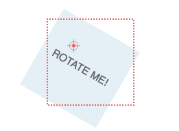
transform: translateX(10px) rotate(10deg);
} | LIVE PREVIEW
Hi!
transform-origin
Sets the origin of element's transformations.
You can specify a keyword (e.g. left, right, top, bottom, or center),
OR up to 3 lengths/percentages (one for each of the x, y, and z axes).
div {
  transform-origin: top right;
  transform-origin: right bottom 2cm;
  transform-origin: 2px 30% 10px;
}
transform-origin: 50px 50px effect with transform: rotate(30deg). (Source: MDN)transform-box
Defines which layout box to which transform and transform-origin relate (?).
border-box— use the border-box as the reference boxcontent-box— use the content-box as the reference boxview-box— use the nearest SVG viewport as the reference boxfill-box— use the object bounding box as the reference box (for SVG only?)stroke-box— use the stroke bounding box as the reference box (for SVG only?)
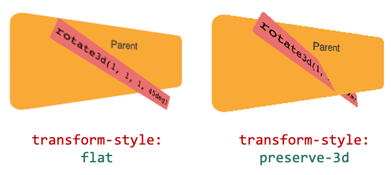
transform-style
Sets whether the children of an element:
flat— are flattened in the plane of the elementpreserve-3d— are positioned in the 3D space (can intersect)
References
- transform (MDN) — https://developer.mozilla.org/en-US/docs/Web/CSS/transform
- transform (MDN) — https://www.bitdegree.org/learn/css-transform#transform-box