Display: Flex
Using display: flex allows you to create elements that can grow, shrink, or re-align to fit the remaining space.
<!-- Equal spacing between item -->
<nav id="flex-example">
  <a href="#">Page 1</a>
  <a href="#">Page 2</a>
  <a href="#">Page 3 is longer</a>
  <a class="push-right" href="#">Page 4</a>
</nav>#flex-example {
display: flex;
border: 1px solid #999;
justify-content: space-between;
padding: 5px;
column-gap: 5px;
}
#flex-example a {
padding: 10px;
background: #ccc;
}Terminologies
- Flex containers refer to the element which you set
display: flexordisplay: inline-flex - Flex items refer to the direct children of a flex container
- Main-axis is the direction along
flex-direction - Cross-axis is the direction perpendicular to the main-axis
Flex Container Properties
Tip!
If you easily mix up justify-content, align-content, and align-items properties, just remember:
"Justify along the main axis, align along the cross axis"
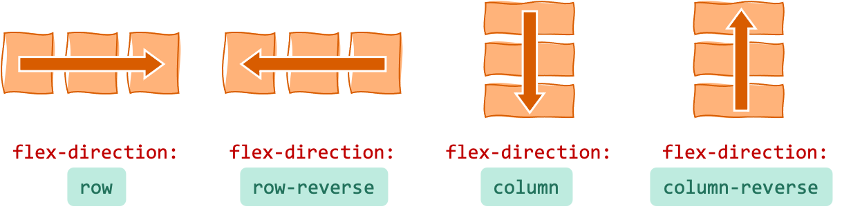
flex-direction
Which direction the flex items go.
(Note: the normal direction of row depends on the directionality of the text: left to right if LTR, right to left if RTL.)
flex-wrap
What to do if flex items does not fit in one line.
nowrap— force everything in one linewrap— wrap from top to bottomwrap-reverse— wrap from bottom to top
flex-flow
Shorthand for flex-direction and flex-wrap
.container {
  flex-flow: <flex-direction> <flex-wrap>;
}
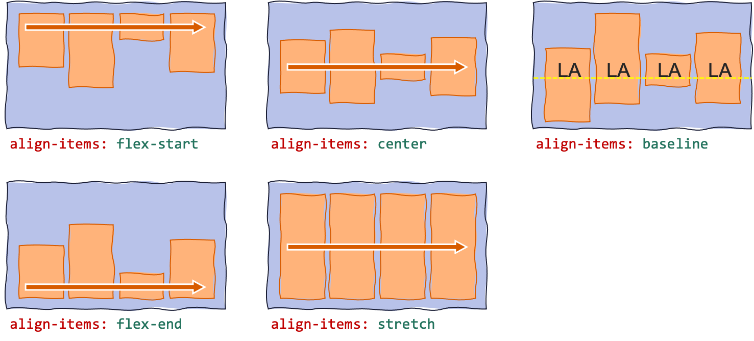
align-items
Defines how items are aligned along the cross-axis, relative to each other.
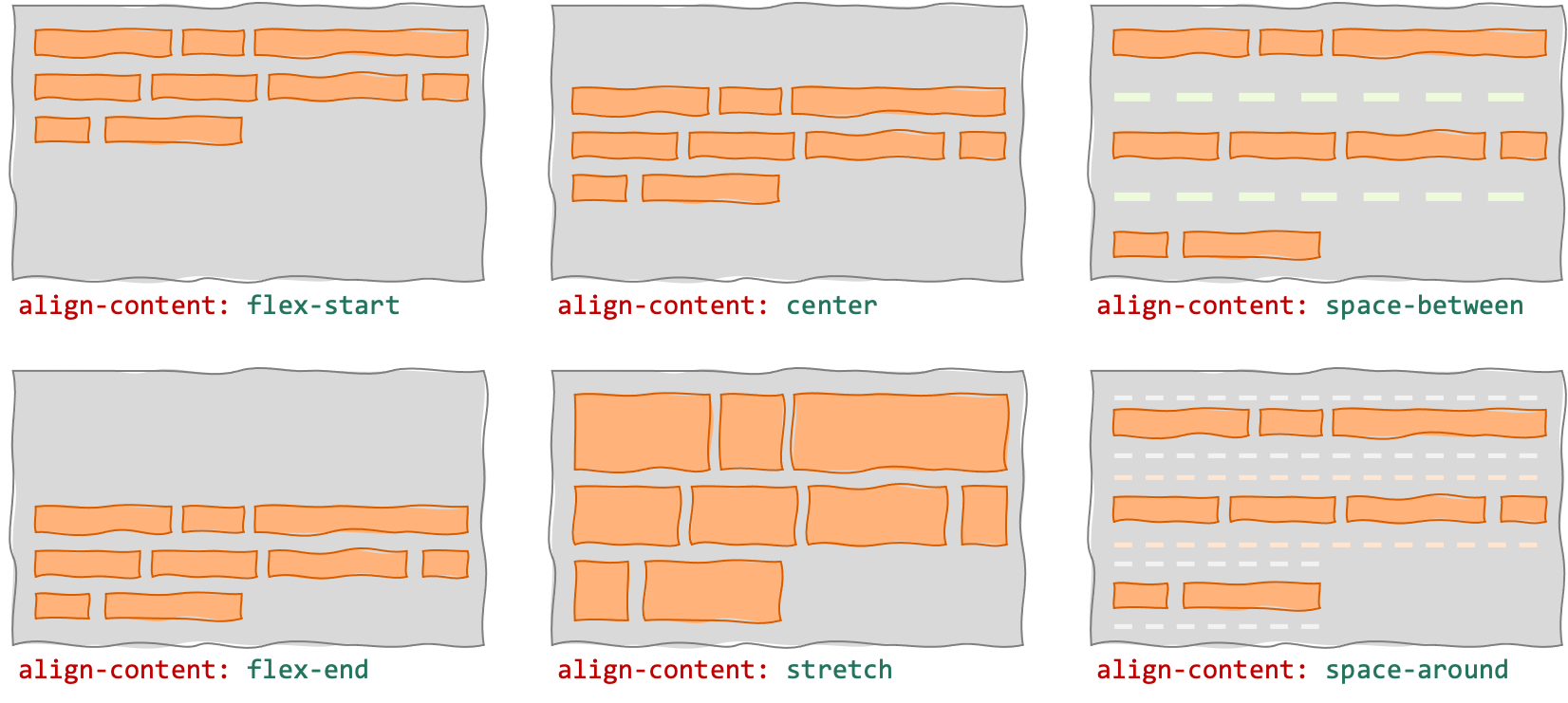
align-content
Defines how the "content" (all items) is aligned along the cross-axis, if there's an extra space.
(Default value is stretch.)
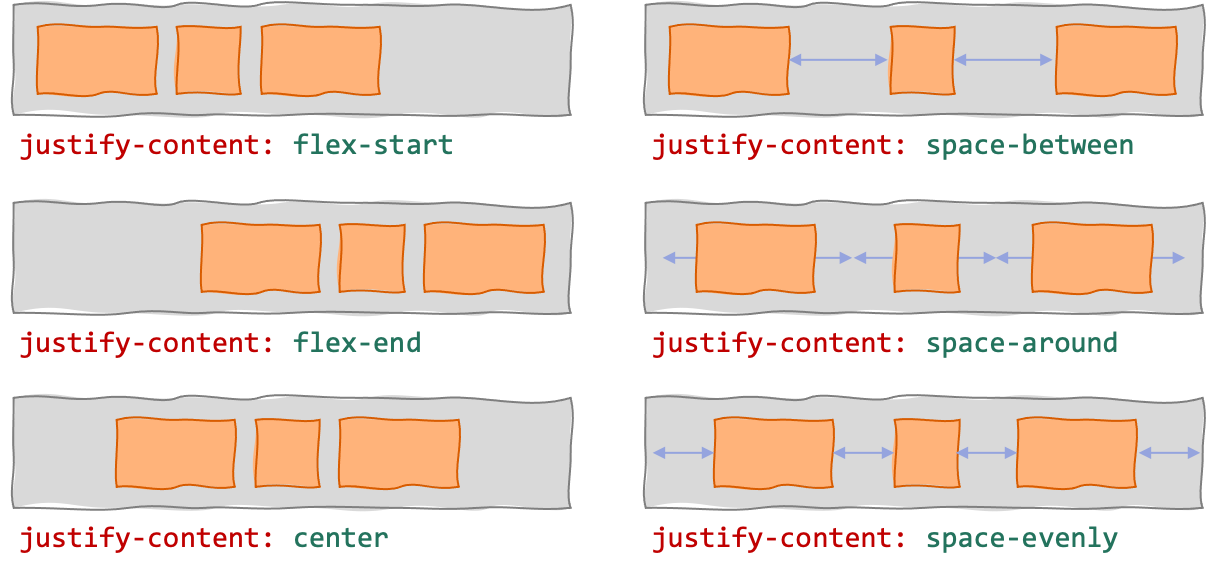
justify-content
Defines how the "content" (all items) is aligned along the main-axis, if there's an extra space.
(If the items overflow into multiple lines, then justify-content alignment is applied independently to each line.)
row-gap
Specifies gutter size between rows.
column-gap
Specifies gutter size between columns.
gap
Shorthand for row-gap and column-gap
.container {
  gap: <row-and-column-gap>;
  gap: <row-gap> <column-gap>;
}
Flex Items Properties
order
Defines order of a flex item in the flex container.
(Default value is 0, and items normally appear in source order.)
flex-grow
If there's a remaining space in the flex container, this defines the ratio of the remaining space to be given to the flex-item to make it "grow" (so it fills the remaining space).
(Default value is 0, which means the flex item won't expand to fill the remaining space.)
flex-shrink
If there's not enough space in the flexbox container, this defines the ratio of how much space should be taken from the flex-item to make it "shrink" (so everything fits).
(Default value is 0.)
flex-basis
Sets the initial size of a flex item (before it "grows" or "shrinks").
auto— set initial size according to the width/height of the flex item's content- percentage or absolute value, e.g. or
20%or100px— set initial size to this value
flex
Shorthand for flex-grow, flex-shrink, and flex-basis.
flex: noneis synonymous withflex: 0 0 auto(not flexible at all, i.e., cannot grow and shrink)flex: autois synonymous withflex: 1 1 auto(grows and shrinks to fit in the container)
.item {
  flex: <flex-grow> <flex-basis>;
  flex: <flex-grow> <flex-shrink>;
  flex: <flex-grow> <flex-shrink> <flex-basis>;
  flex: none;
  flex: auto;
}
align-self
Override align-items value for this item only. Specify: auto, flex-start, flex-end, center, stretch, or baseline.
align-self: automeans use the container'salign-itemsvalue
References
- A Complete Guide to Flexbox (CSS-Tricks) — https://css-tricks.com/snippets/css/a-guide-to-flexbox/
- align-content (CSS-Tricks) — https://css-tricks.com/almanac/properties/a/align-content/
- CSS Flexible Box Layout (MDN) — https://developer.mozilla.org/en-US/docs/Web/CSS/CSS_Flexible_Box_Layout
- flex-basis (MDN) — https://developer.mozilla.org/en-US/docs/Web/CSS/flex-basis
- Typical use cases of Flexbox (MDN) — https://developer.mozilla.org/en-US/docs/Web/CSS/CSS_Flexible_Box_Layout/Typical_Use_Cases_of_Flexbox