Filter
You can also use a filter definition from SVG, e.g.
filter: url(#my-filter).The filter property applies graphical effects like blur or color shift to an element.
CSS Properties
filter
Applies filter(s) to an element.
Specify none or space-separated filter function(s).
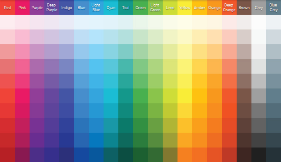
<div id="filter-example">
  <img src="/res/sample/material-color-palette.png">
</div>#filter-example img {
filter: blur(5px);
} | LIVE PREVIEW
backdrop-filter
Applies filter(s) to the area behind an element.
Specify none or space-separated filter function(s).
<!-- May not work on Firefox; use Chrome -->
<div id="backdrop-filter-example">
  <div class="inner-box">
    Hello there!
  </div>
</div>#backdrop-filter-example {
width: 300px;
height: 200px;
display: flex;
align-items: center;
justify-content: center;
background-image: url('/res/unsplash/andrew-ridley-jR4Zf-riEjI-unsplash.jpg')
}
#backdrop-filter-example .inner-box {
padding: 10px;
border: 1px solid white;
border-radius: 4px;
backdrop-filter: blur(10px);
} | LIVE PREVIEW
Hello there!
Assets
- Material Color Palette — https://materialcolor.xyz/
- Andrew Ridley (Unsplash) — https://unsplash.com/photos/jR4Zf-riEjI
References
- filter (MDN) — https://developer.mozilla.org/en-US/docs/Web/CSS/filter
- backdrop-filter (MDN) — https://developer.mozilla.org/en-US/docs/Web/CSS/backdrop-filter